SLW Photo Remakes
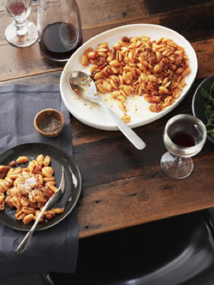
One of my favorite magazines to flip through for the photography is Gourmet Traveller. The stylists and photographers have an amazing way of elevating even the simplest dishes to art. I loved this shot by Chris Chen and styled by Lynsey Fryers.

I love the dark, warm tones of the wood, with the soft light. I also love the slightly messy look, with the one plate just barely nudging its way into frame. To get a great shot, you’ll really need to pay attention to the composition.
For this photo remake, feel free to make the recipe… it sounds amazing. Or, just use any simple pasta in sauce.
If you are new to the monthly photo challenges, head over to the Flickr group for the rules and to introduce yourself.
This challenge will run through the end of May.
[the photo above is by Chris Chen, and styled by Lynsey Fryers]
O wow that is a serious challenge!! Love the photo, but it’s going to be difficult to recreate! I’ll give it my best shot though!
This photo is great! I aspire to create images like this and have learned a lot from your web-site, but my question is…how do you make something “boring” look interesting? Chris has taken monocromatic colors and made them interesting to look at. Is this a trial and error or is there method behind the madness? My “simplest dishes” always end up looking uninteresting.
Victoria – Great question! And one that there isn’t an easy answer too. There is certainly not one right answer. I think the key (which I believe is true with all photography) is to think about it like art. Either the art creates a story, or it removes all concepts of the subject and focuses on the pure aesthetic (think Mondrian). Either can work. But if you look at work by those who are truly exceptional in this space, that’s what you’ll find. The first, I think, is a bit easier to do and to me just as compelling. In Chris’s photo, it’s about the story… you find yourself wondering, who was just there eating that food, what does it taste like, can I sit there?
From a technical standpoint, it’s all about the same things… the right light, the right composition, the right focus.
Am I missing something…. I don’t see a link to the recipe you’re referencing? You say it sounds great, so I’d love to see it, but I’m not finding it.
Oops! You are right. Here’s the recipe:
http://gourmettraveller.com.au/malloredus_alla_campidanese.htm
Thanks!
How did I JUST find your site? I love it!
Thank you for the education and inspiration.
I’m trying to understand how this image works.
OK,I see Chris Chen is helping us imagine a story here. That’s a step away from a “Mmmm perfect looking food…lets get some of that” food photo. This is a lot less formal a image, and it does make you wonder.
Looking at Chris Chen’s website I see most shots are cropped thru objects in the frame. I gather that’s a personal style thing. The image above has 7 of 12 items cut off in some way. I find that somehow irritating. I’m not sure why. It initially looks like a snapshot. How does one decide what to chop off? There must be more than just getting in close, right?
The composition has the two pasta elements in roughly rule of thirds intersections. And nice leading lines in the wood connecting to them. The chair at the bottom I gather is a story element, but it takes my eye right off the image. Likewise the chopped wine glass in the upper left takes me right out of the image and not back into it. Should I be seeing this image somewhat differently?
Stuff Junkie – I love how your are digging into the image! The dishes just peeking into frame don’t bother me… it feels kind of like a slice of life, there’s a tension created by it that makes me want to know more… but that’s just me. It’s a personal thing. The good news is that for your shot, you can make it the way you want!
I agree this is definitely a slice of life shot. If we’re doing photo remakes then I want to understand what I try and copy. The beauty/frustration with still life is you ‘should’ have total control. Everything is in the frame for a reason. I’d like to learn what went on inside the head of those putting together the shot. Why so many chopped objects? Why is the second brightest item in the image at the upper edge of the frame? Why is the fork on it’s side-Who does that? How do you decide what goes in the image; where each item is placed; camera angle; etc? If tension is a desired effect, how do you go about creating that from a table and a bowl of pasta?
I’ve recently become interested in food photography and I’m really glad I found your site (through a link on DPS).
I really like the assigments you run and can’t wait to give it a go! It’s not a typical image that I conjure up when I think of food photography and I like that. It’s good to see it’s not all perfect images, this is very much ‘still life’…
L,
I love this shot as well and am a big fan of gourmet traveller and chris chen. was lucky enough to attend a shoot for a day with chris and lynsey a few months ago which was absolutely inspirational. both are really lovely creative people.