SLW September Remake: Snap to Styled
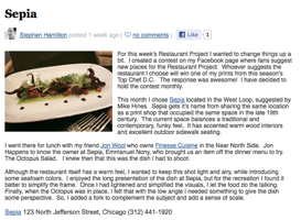
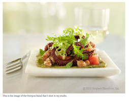
I’m going to change up the monthly challenges this month. I don’t know if you’ve seen it before, but I love the Restaurant Project from Stephen Hamilton. Each week or so, he takes a photo of some delicious food that he has at a restaurant on his iPhone. The lighting is terrible, so the photos are always marginal. Then, he recreates a version of the dish in his studio… this time with all the beautiful lighting and props (with a short description of what he did). Here’s a sample from his site:
I think this is great project on so many levels… using a cell phone camera to snap a quick shot in the restaurant means less futzing before diving into your food… you can worry about making a beautiful photo later. It’s also a great way to learn to make the dish yourself, something I always mentally note when I’m eating out but then forget somewhere along the way. Finally, it’s a great reminder that lighting and styling plays an enormous role in great food photography!
So this month, I want to take a cue from Stephen, and have you remake a dish from a not so great photo. You can do this in one of two ways:
- Eat out, snap a quick shot, and then make the beautiful shot later or
- Find a recipe somewhere out there on the web that you want to try but that is just illustrated with a quick, unstyled snapshot, and make your styled shot from it.*
It’s really helpful when you use the new diptych format when you post your results!
If you are new to the monthly photo challenges, head over to the Flickr group for the rules and to introduce yourself.
This challenge will run through the end of September.
*If you do decide to create a styled photo from a blog snapshot, consider sharing it back with the original author. I’m sure there are many bloggers out there that would love a beautiful shot to accompany their post, but don’t have the time, equipment, etc. to take it themselves.


I love this challenge – I had something at dinner last night that I want to recreate…and the phone photo I took is just dreadful. I’m in for this challenge, for sure 🙂
Stopped by SLW to see what’s new and was so surprised to see the Sepia shot as an example for the remake! We were all very happy with the final image, too. Thanks for the compliment to both photography and styling.
Today is Dec 9 ,2011 and the ‘restaurant project’ link is non-working. Love your site though